Ethiopia vs US size comparison
How Big Is Ethiopia Compared to the US?
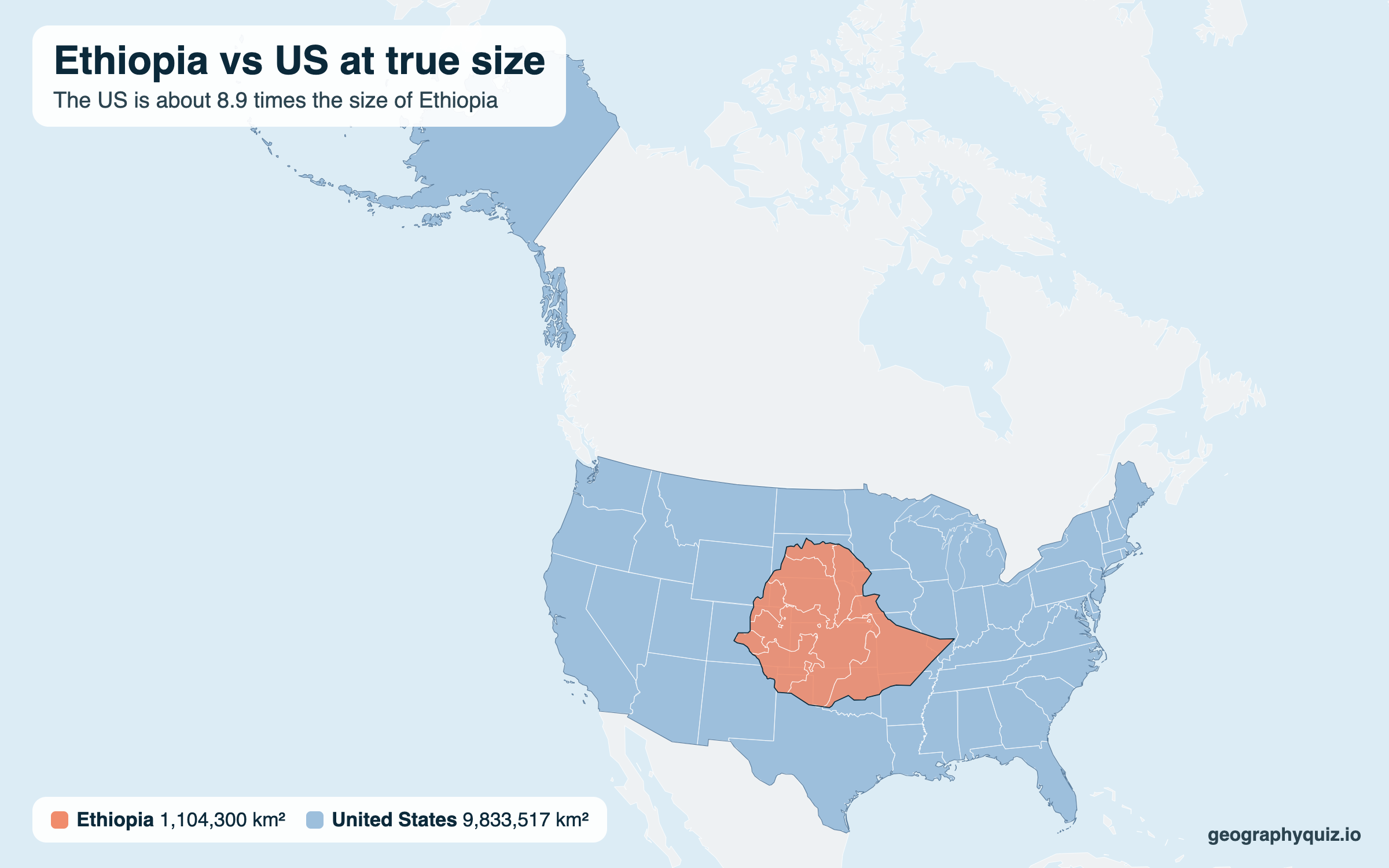
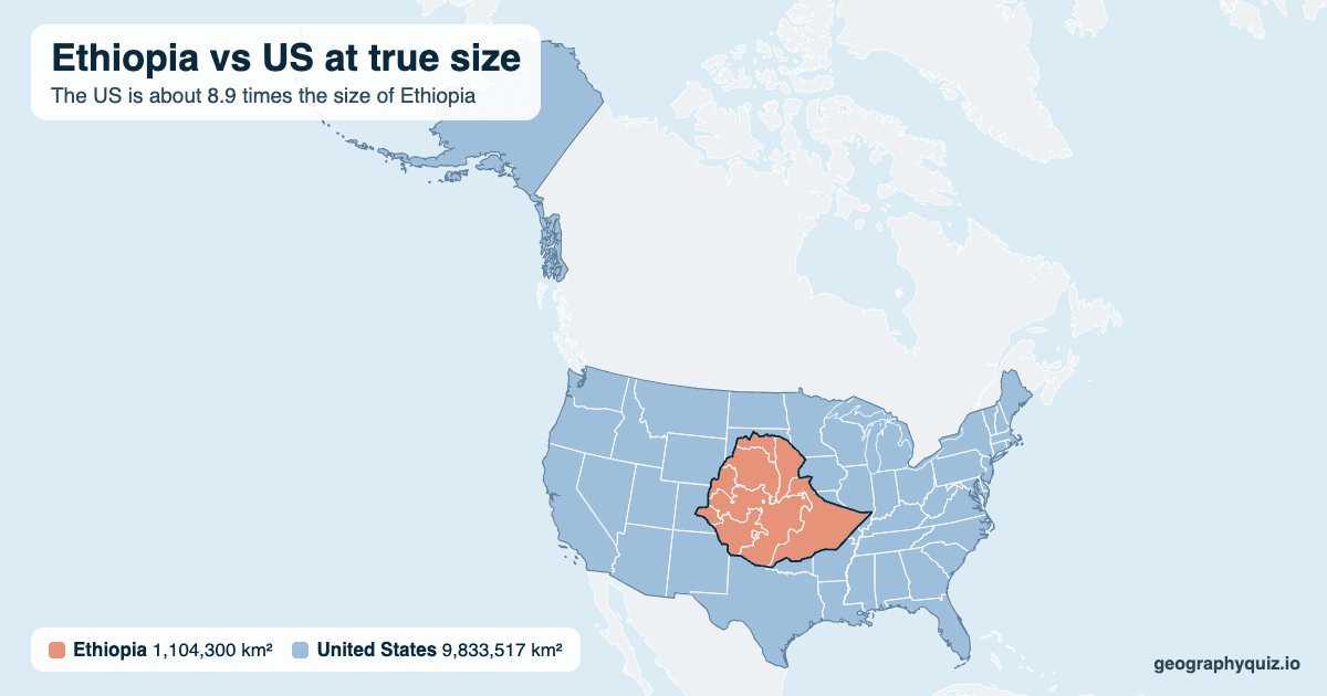
The US is about 8.9 times the size of Ethiopia. Ethiopia is about 3.5 times as densely populated. Drag Ethiopia over the US below to see the difference at true size.
Hawaii and the territories are not drawn.
Printable Ethiopia vs US size comparison
Free to print or share: Ethiopia laid over the US at true size, with both areas, on one landscape A4 or US Letter page.
Key facts
- Area of Ethiopia
- 1,104,300 km² (426,372 sq mi)
- Area of the US
- 9,833,517 km² (3,796,741 sq mi)
- Size difference
- The US is about 8.9 times bigger
- Closest US state in size
- Alaska (1,724,220 km²)
- Population (2025)
- Ethiopia 135,472,051; the US 341,784,857
- Ethiopia's rank by area
- 26th-largest of 197
How big Ethiopia is compared with the US
The US is about 8.9 times the size of Ethiopia: 9,833,517 km² (3,796,741 sq mi) against 1,104,300 km² (426,372 sq mi). Even the 48 contiguous states alone, without Alaska, could hold Ethiopia about 7.3 times. Ethiopia is bigger than every US state except Alaska. It is the 26th-largest of the world's 197 countries, and the tenth-largest of 54 in Africa; the US is the third-largest.
Ethiopia has about 135 million people (2025), the tenth-most populous country in the world, against 342 million in the US. With 123 people per km² it is about 3.5 times as crowded as the US (35 per km²), the 76th-most densely populated country.
Ethiopia and the US on a world map
Ethiopia reaches from 3°N to 15°N; the US from 19°N to 71°N, with Hawaii in the south and Alaska in the far north. Most world maps use the Mercator projection, which enlarges places more the further they are from the Equator. It draws Ethiopia about 1.03 times its real size and the US about 2.3 times (Alaska far more than Florida). So on a normal world map the US looks about 20 times the size of Ethiopia, when it is really about 8.9 times. The equal-area map above shows the real difference.
Where Ethiopia is
Ethiopia's capital, Addis Ababa, is 11,520 km (7,160 miles) from Washington, D.C. as the crow flies. Ethiopia borders 6 countries: Djibouti, Eritrea, Kenya, Sudan, Somalia and South Sudan. It has no coast.
Ethiopia and US in numbers
| Ethiopia | US | Difference | |
|---|---|---|---|
| Area | 1,104,300 km² 426,372 sq mi | 9,833,517 km² 3,796,741 sq mi | The US is 8.9× bigger |
| Population (2025) | 135,472,051 | 341,784,857 | The US has 2.52× more |
| Rank by area | 26th-largest | Third-largest | of 197 countries |
| People per km² | 123 | 35 | Ethiopia is 3.5× denser |
| Capital | Addis Ababa | Washington, D.C. | 11,520 km apart |
| Neighbouring countries | 6 | 2 |
Ethiopia compared with US states
Frequently asked questions
Is Ethiopia bigger than the US?
No. The US is about 8.9 times the size of Ethiopia: 9,833,517 km² (3,796,741 sq mi) against 1,104,300 km² (426,372 sq mi).
How many times would Ethiopia fit into the US?
About 8.9 times (8.90). Into the 48 contiguous states alone, about 7.3 times.
Which US state is Ethiopia closest in size to?
Alaska (1,724,220 km²). Alaska is about 1.56 times the size of Ethiopia.
Is Ethiopia bigger than Texas?
Yes. Ethiopia is about 1.59 times the size of Texas (695,668 km²).
Which has more people, Ethiopia or the US?
The US: about 342 million people in 2025, about 2.52 times the 135 million in Ethiopia.
Why does Ethiopia look so small on a world map?
Most world maps use the Mercator projection, which stretches places more the further they are from the Equator. The US is further from the Equator than Ethiopia, so it is stretched more. On a Mercator map the US looks about 20 times the size of Ethiopia, not 8.9.
Where does Ethiopia rank by size?
Ethiopia is the 26th-largest of the world's 197 countries by total area and the tenth-largest in Africa. The US is the third-largest.
How far is Ethiopia from the US?
Ethiopia's capital, Addis Ababa, is 11,520 km (7,160 miles) from Washington, D.C. in a straight line.
Sources
- Areas: CIA World Factbook (total area, land and water). US states: US Census Bureau.
- Populations: World Bank, World Development Indicators (2025).
- Outlines are drawn on an equal-area projection, so their sizes on the map match their real areas.